Wikipedia
Redesign
Wikipedia
Redesign
Overview
Wikipedia is a web-based, free encyclopedia with openly editable and viewable content, a wiki. It is used by everyone to find information on various topics. For our Interaction Design Studio, we decided to redesign the website to improve the user experience and make information more discoverable. We also designed an AR app which helps in finding information about real-life objects by using the phone camera.
Client: Class / Personal Project
Role: Interaction Designer
Time: 10 weeks
Tools: Sketch, InVision
Team: Sravya Amancherla, Simone
Pimento, Dhruvi Patel
Client: Class / Personal Project
Role: Interaction Designer
Time: 10 weeks
Tools: Sketch, InVision
Team: Sravya Amancherla, Simone
Pimento, Dhruvi Patel
The Problem
The website lacks the easy experience that it is supposed to provide. It is overwhelming with a lot of text, functions, and features. The website is very old and outdated and lacks interactivity and explorability.
The Problem
The website lacks the easy experience that it is supposed to provide. It is overwhelming with a lot of text, functions, and features. The website is very old and outdated and lacks interactivity and explorability.
Project Goals
- To improve the user experience of the website.
- Redesign the way information is displayed.
- Encourage exploration of the website.
- Rearrange and reduce options available to users so as to make the website less overwhelming.
Project Goals
- To improve the user experience of the website.
- Redesign the way information is displayed.
- Encourage exploration of the website.
- Rearrange and reduce options available to users so as to make the website less overwhelming.
Research Methods
User Demographic
For the scope of this project, we focused on university students who use Wikipedia to find information. We conducted 6 user interviews. The interviews were a mix of semi-structured interviews as well as retrospective accounts of how users looked for information online.
From our research, we wanted to understand the major issues that users faced while using the website. We conducted several interviews and heuristic evaluation to understand the current Wikipedia website.
- User Interview: It provided us the key concerns and motivations for people around which we drove our design.
- Empathy maps: It helped us identify the pain points and motivations behind each task performed by users.
- Heuristic Evaluation: Through the evaluation, we aimed to measure various factors that affected the user’s decisions on the website, which helped us redesign it.
Findings and Insights
- Information hierarchy: For a text-heavy website like Wikipedia, the information hierarchy is very important. Finding the information needed should be simple. Currently, the Wikipedia pages do not afford easier finding of information.
- Visual Design: Good visual design improves readability and makes information easier to find. The current Wikipedia design is dated and was directly impacting the bounce rate of the website.
- Navigation: Wikipedia navigation is very confusing and the names of various functionalities are very technical and hard to understand.
- Feature Discoverability: Wikipedia is a vast repository of knowledge and has various functionalities. But, most of our users had no idea about them. No one uses the main page, and they don’t know what to do once they reach there. Also, they weren’t aware of all the features that Wikipedia provides.
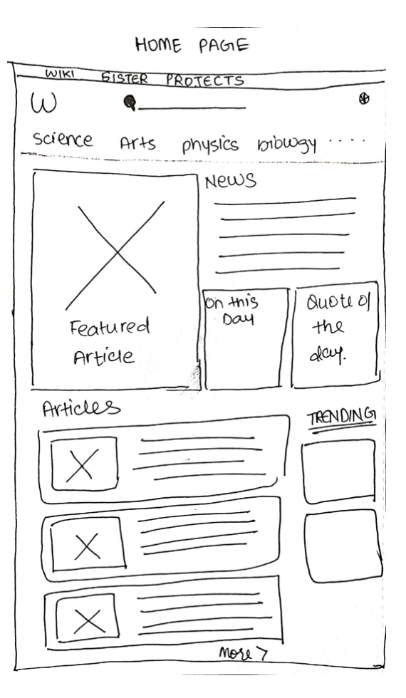
Design Process
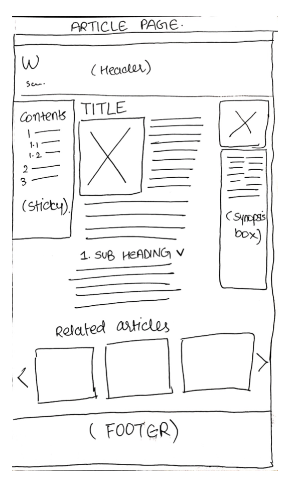
Low Fidelity Prototype
We started our design process by building wireframes to test out the basic layout and interaction of our redesign. From the feedback that we collected, we started making initial design sketches for the website.
Design Process
Low Fidelity Prototype
We started our design process by building wireframes to test out the basic layout and interaction of our redesign. From the feedback that we collected, we started making initial design sketches for the website.
High Fidelity Prototype
We built a high fidelity prototype of our sketches and tested it out with various users. The high fidelity prototype included all the basic functions and features of our redesigned Wikipedia website.
High Fidelity Prototype
We built a high fidelity prototype of our sketches and tested it out with various users. The high fidelity prototype included all the basic functions and features of our redesigned Wikipedia website.
On testing our high fidelity prototype, we got the following feedback :
- The clean layout worked, but the colors were overwhelming
- The absence of negative space made it crowded
- The different layout for the portal page and the home screen messed with the mental model
- The reduced width of the body copy text was a refreshing change to the current website but could go even narrower
- The pictures could be included within the body text
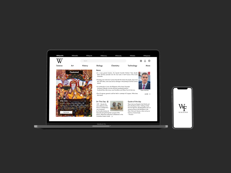
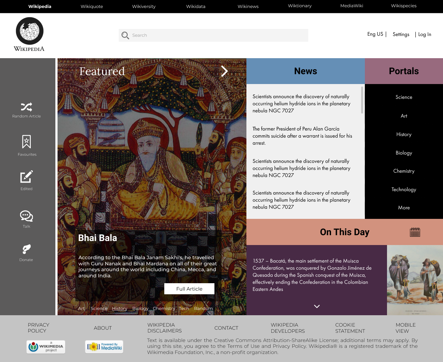
Final Design
Our final design of the website was a lot less overwhelming. We got rid of the colors and stuck to a modern, clean theme. The article pages provided a quick synopsis for users as well as collapsible sections so that users may find information easily.
Final Design
Our final design of the website was a lot less overwhelming. We got rid of the colors and stuck to a modern, clean theme. The article pages provided a quick synopsis for users as well as collapsible sections so that users may find information easily.
Key Takeaways
• Limit color
• Too many interactions are confusing
• Keep it simple
• Prioritize information
• Keep iterating
Key Takeaways
• Limit color
• Too many interactions are confusing
• Keep it simple
• Prioritize information
• Keep iterating
Reach out for design opportunities or if you want to chat.
Reach out for design opportunities or if you want to chat.